When Metrics go Awry: Analyzing KPIs using machine learning and regression analysis
Finding drivers for your KPIs

Every week, management teams at companies around the world gather to review the weekly dashboard. Inevitably, one of these key metrics … is red. How do we turn it from red to green?
There are two typical reactions to a metrics incident:
- Wait another week to see if it’s a trend.
- Schedule a meeting to investigate this metric.
Neither of these approaches are particularly satisfying. The flaw of the first is that if the problem is a trend, you’ve just lost a week of time to address the issue. The flaw of the second is that traditional analysis techniques don’t tell you why, and frequently lead into a round of expensive and inconclusive data analysis.
Segmentation: Traditional analysis
The management team elects to go with Option 2. What happens in that meeting?
The traditional tool used is segmentation. Typically, the KPI is decomposed into different segments: geography, customer size, gender, and so forth to see if there is a common segment that is underperforming.
The data team works steadily for the next day writing SQL queries to produce a set of dashboards that show the metric in question by segment. They figure it’s worth codifying these segments the next time something happens.
The dashboards show that the metric has gone down for most segments, but it’s most pronounced in N. America. Now what?
The team has run into the core problem with segmentation: segmentation only identifies what segment(s) are affected by the KPI change. Segmentation does not provide any insight into what might be driving the change. Conversations with marketing & product ensue to ask if they’ve changed anything in the past week that might affect most customers, but particularly N. America customers. This is inconclusive.
Regression analysis
Regression analysis is a statistical method used to model the relationship between a dependent variable (in this case, the KPI) and one or more independent variables). The goal of regression analysis is to understand how the independent variables impact the dependent variable.
The earliest forms of regression analysis were published in 1805 (!). Since then, research in regression analysis has resulted in sophisticated algorithms that can find patterns in noisy and non-linear data. The most recent of these algorithms fall into the “machine learning” category, and take advantage of the awesome computational power of modern CPUs & GPUs. We’ll see how these algorithms can be used to analyze a KPI.
Insurance and LTV
We’ll start with the VahanBima customer lifetime value dataset. We previously used this data set to build a regression model for LTV. This data set has approximately 90,000 insurance customers and their lifetime value. To simulate a drop in LTV, we’ll add another 10,000 synthetic customers based on this dataset. If you want to try this yourself, you can download the updated dataset here.
First, let’s take a look at the LTV of this dataset. We can graph the trend line of LTV using a simple moving average, and show it here:
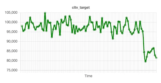
Why is LTV down? This data set has multiple independent variables: number of policies, claim amount, area, marital status, and so forth. We’ll now explore which of these variables, if any, could be causing this drop in LTV.
In the previous article, we trained a regression model on the same dataset to find ways to increase LTV, so we won’t re-train a model here. Instead, we’ll start where we left off, which was with the feature importance chart.
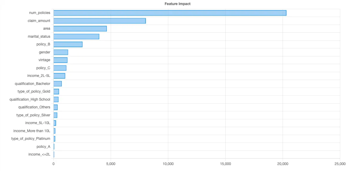
Let’s look at each independent variable, in descending order of feature importance, to see if we can identify what might be driving LTV down. For each variable, we’ll look at three factors:
- The feature importance, which we have previously computed using Shapley values.
- The trend line, which we can compute using a simple moving average (SMA).
- The expected impact of the variable on LTV as the variable increases & decreases, which we can visualize using Shapley values.
The variable with the highest feature importance in this data set is number of policies. Here’s the trend line:
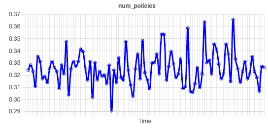
There is no discernible pattern in this trend line, so we can dismiss a change in the number of policies issued as the driver of the CLTV.
Let’s look at the next variable, claim amount. Here’s the trend line:

There’s an obvious drop in the claim amount for more recent customers. We didn’t need any fancy regression analysis or machine learning to identify this trend. But our model lets us go one step further, because a drop in an independent variable does not necessarily correspond to a drop in the target variable. We can look at the Shapley chart for claim amount to understand this further:
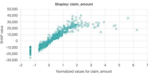
Shapley scatter charts are a powerful tool that gives a sense of how changes in the independent variable impact the predicted value. In this chart, each dot represents a single prediction from the data set. The x-axis is the specific value of the independent variable, while the y-axis is the change in the target for a given x-axis value.
Shapley scatter charts also help identify situations where independent variables are not completely independent. When the predicted values on the y-axis have a wide dispersion for the same x-axis value, that suggests that there are other factors in play besides the independent variable in play. Similarly, if there is a narrow dispersion, this suggests the independent variable is driving the given prediction.
The Shapley scatter chart for claim amount is suggestive. As the claim amounts increase, so does the LTV (presumably via increased premiums). There is relatively narrow dispersion in the chart, which suggests that claim amount is fairly independent.
We now have a hypothesis! We can quickly scan the trend lines in the other independent variables, and our eye quickly settles in on the spike in vintage:
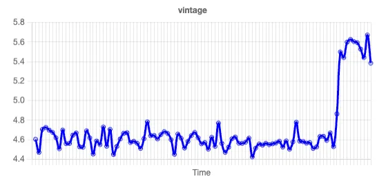
Vintage is the number of years a customer has been a customer. We look at the Shapley chart:

Here, we see wide vertical dispersion for each vintage, and no clear changes in value. This suggests that there are high & low LTV customers at every vintage, and as such, the increase in vintage is unlikely to be causing any impact on LTV. We thus conclude that the recent drop in LTV is driven by a drop in claim amounts by customers. (This also suggests that LTV may not be the ideal metric for measuring insurance customers, as the increase in LTV associated with claim activity does not necessarily mean an increase in profitability.)
Segmentation & dashboards are insufficient
When key performance indicators go down, traditional approaches like segmentation can only go so far in pinpointing the root cause. While segmentation identifies which segments are affected, it often falls short in providing actionable insights into why the change occurred.
More generally, dashboards are poor tools for identifying relationships in data. Modern regression analysis can help bridge this gap between problem and action. By modeling the relationship between the KPI and various independent variables, regression analysis can uncover hidden patterns and factors driving the KPI change.
The answer could be in your data. If it’s there, regression analysis will help you find it.